Session 2: Scatter Plots
Topics
- Determine when a scatter plot is an appropriate data visualization tool
- Manipulate plotting symbols and colors to plot metadata
- Adapt existing code to achieve a goal
- Install R packages and libraries
- Axis labels
- Getting help
Scatter plots
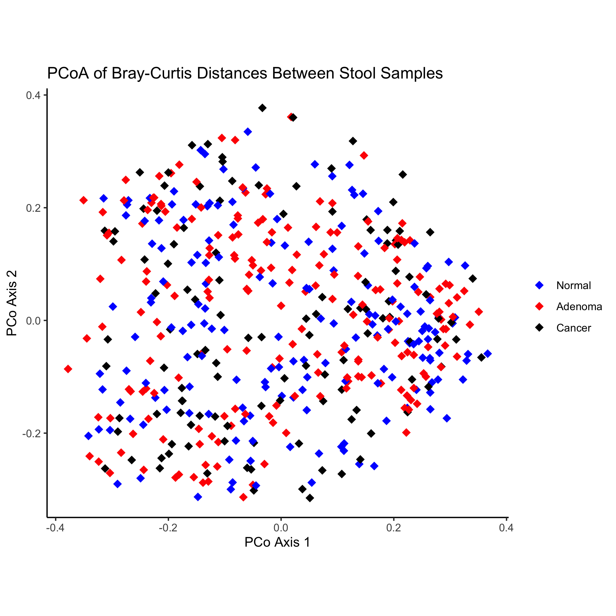
Scatter plots are commonly used to plot two continuous variables against each other. Usually the x-axis contains the independent variable and the y-axis contains the dependent variable. For example, one could plot calories consumed on the x-axis and the individual’s weight on the y-axis. Other times, it is used to visualize a correlation. For example, one might plot individuals’ weights against their heights to see whether there is a linear relationship. In microbial ecology, a common approach is to use ordination to visualize the similarity between samples. In the case of Principle Coordinates Analysis (PCoA), the first axis explains the most variation in the data, the second axis explains the second most variation, and so forth. In the game of microbial ecology bingo, these ordinations represent the center square. Let’s see how to make one in R.
library(tidyverse)
library(readxl)

pcoa <- read_tsv(file="raw_data/baxter.braycurtis.pcoa.axes")
metadata <- read_excel(path="raw_data/baxter.metadata.xlsx")
metadata_pcoa <- inner_join(metadata, pcoa, by=c('sample'='group'))

ggplot(metadata_pcoa, aes(x=axis1, y=axis2, color=dx)) +
	geom_point(shape=19, size=2) +
	scale_color_manual(name=NULL,
		values=c("blue", "red", "black"),
		breaks=c("normal", "adenoma", "cancer"),
		labels=c("Normal", "Adenoma", "Cancer")) +
	coord_fixed() +
	labs(title="PCoA of Bray-Curtis Distances Between Stool Samples",
		x="PCo Axis 1",
		y="PCo Axis 2") +
	theme_classic()

ggsave("ordination.pdf")
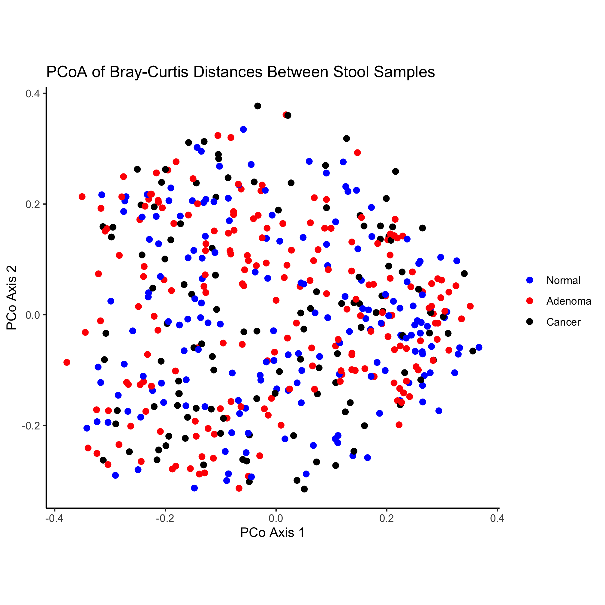
What’s going on in this chunk of code? One of the nice things about working in R is that the code can be quite readable so that a novice can figure out what is going on. This chunk of code has four sections. First, we are asking R to load two libraries called tidyverse and readxl. Second, we are reading in two files and joining them together. Finally, we are plotting some of the data from the joined data and saving it as a PDF. There are a couple of details that are helpful to notice here:
- R is a very expansive language that many people from diverse backgrounds and interests are helping to develop. This has resulted in numerous packages to make life easier. The
tidyverseis a set of packages that has been a game changer for R. - A function (e.g.
read_tsv) takes arguments. These arguments are contained within round parentheses (i.e.() and if there are multiple arguments, they are separated by a comma - Parameters for the arguments that are textual are wrapped in quote marks (i.e.
"or'). It doesn’t matter whether you use single (i.e.') or double (i.e.") quotes, but be consistent and you have to match a single quote with a single quote and a double with a double. - Sometimes functions can be used as arguments in other functions (e.g.
element_blank) - Addition (i.e.
+) isn’t always for adding numbers!
Activity 1
- Put a
#at the start of the lines withgeom_pointandcoord_fixed. What do these lines do? - Take the line of code that starts
geom_pointand move it to after thecoord_fixedline. Does the plot change?
Activity 2
The library(tidyverse) code loaded the tidyverse package, which is a bundle of other packages. You can see which packages are loaded by by running tidyverse_packages(). Pick three of packages it loaded and find a description of each.
Activity 3
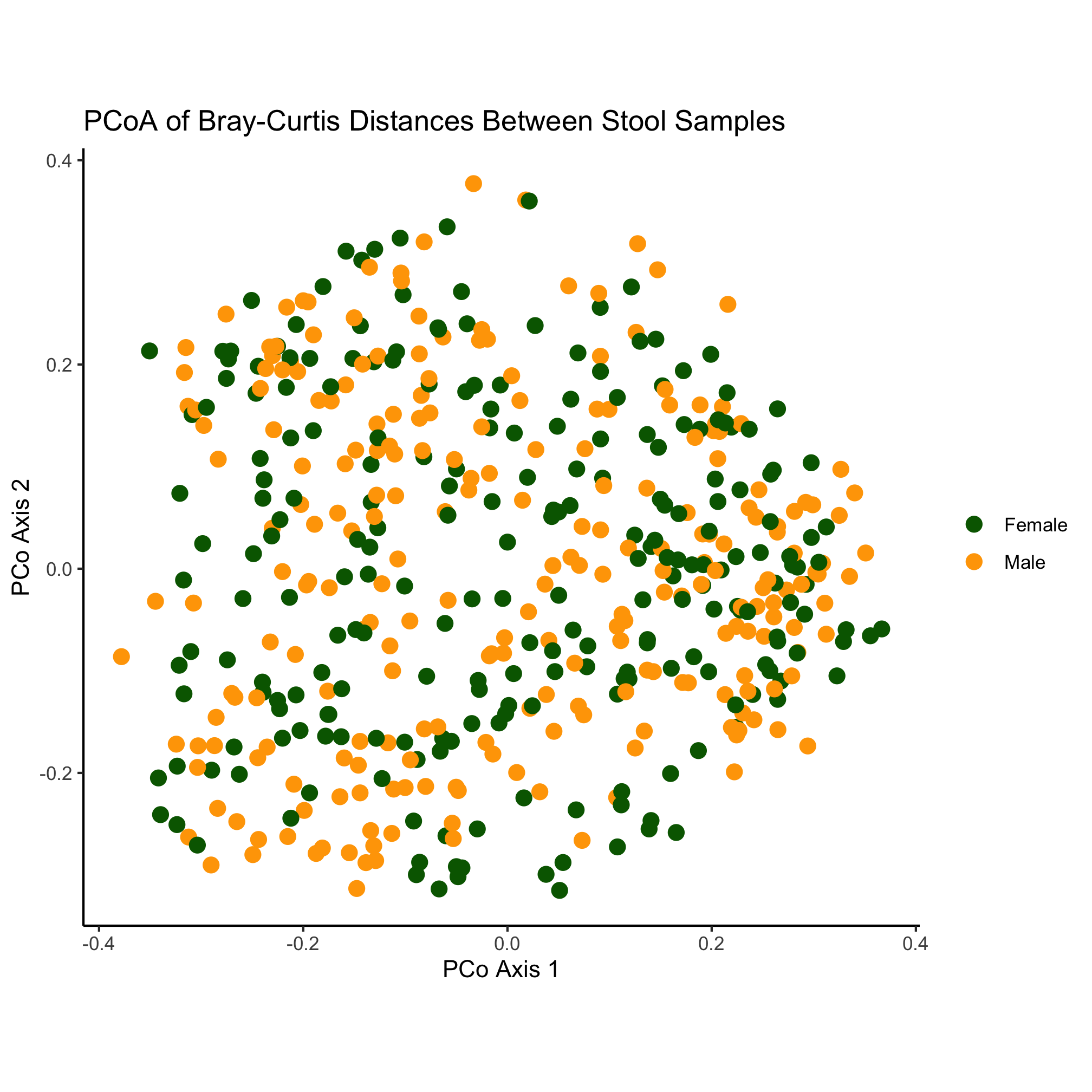
- Change the plotting symbol from a circle to a diamond
- Make the plotting symbols a smidge larger
- Output a
pngformatted version of the image
Activity 4
- Write code for a new plot, and adapt the code to make the color represent the “Gender” variable
ggplot2
The ggplot2 package or just “ggplot” as it is commonly known, is a powerful tool for generating figures. The gg in the name refers to the “Grammar of Graphics”, which is a way of thinking of figures as being a series of layers consisting. Originally described by Leland Wilkinson, the grammar has been updated and applied to R by Hadley Wickham, the package’s creator. According to the grammar, a figure consists of the underlying data, aes thetic mappings, geom etric objects, scales, a coord inate system, statistical transformations, and facet specifications. As we have seen already, each of these elements can be manipulated in ggplot2. As we proceed through the tutorials we will gain a greater appreciation for the variety of ways we can manipulate these elements within ggplot2 to make attractive images.
As an introduction to ggplot, let’s break down the plotting section of the code chunk we’ve been working with.
ggplot(data=metadata_pcoa, mapping=aes(x=axis1, y=axis2, color=dx))
Here we can see that the data to be plotted comes from a variable named metadata_pcoa, which is a data frame that contains the data we want to plot. The mapping we are applying to the data consists of assigning various columns from the data frame to aesthetics that we want to plot. Specifically, we will put the data in the axis1 column to the x-axis, the data in the axis2 column to the y-axis, and the data in the dx column (i.e. the diagnosis) to the color that will be plotted at the x and y coordinates. If we run this line in R, we will get a plotting window that doesn’t have any data in it.
ggplot(data=metadata_pcoa, mapping=aes(x=axis1, y=axis2, color=dx))
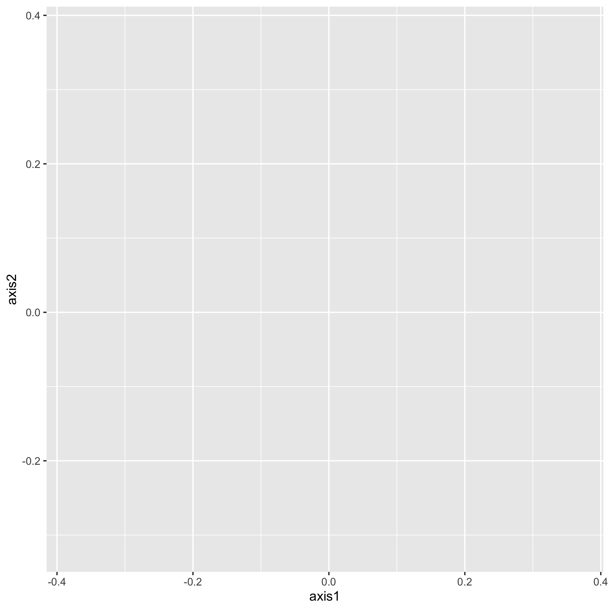
The data are there, we just can’t see them - we need to tell ggplot the geometry that we want to apply to the data. This is contained within the next line, which is “added” to the original plotting window
ggplot(data=metadata_pcoa, mapping=aes(x=axis1, y=axis2, color=dx)) +
	geom_point(shape=19, size=2)

Now it’s starting to look like a figure. There is a subtle point to notice in our geom_point function call. You’ll notice that we are assigning aesthetics to our points without using the aes function in the geom_point. By default, the mapping values in the ggplot function call are applied to subsequent layers of the figure. That means that the points we plot will be colored according to the dx value. We could have done this instead
ggplot(data=metadata_pcoa, mapping=aes(x=axis1, y=axis2)) +
 	geom_point(shape=19, size=2, mapping=aes(color=dx))

Again, we get the same plot. Stylistically, it’s generally best to put your aesthetics mappings as close to the ggplot function call as possible. So, we’ll put it back where we had it. Also, notice that we have two things that we might think of aesthetics outside of the mapping - the shape and size of the points to be plotted. When we set attributes for a plotting aesthetic outside of the mapping, that value gets applied to all of the points in that layer. Notice what happens Here
ggplot(data=metadata_pcoa, mapping=aes(x=axis1, y=axis2, color=dx)) +
	geom_point(shape=19, size=2, color="black")
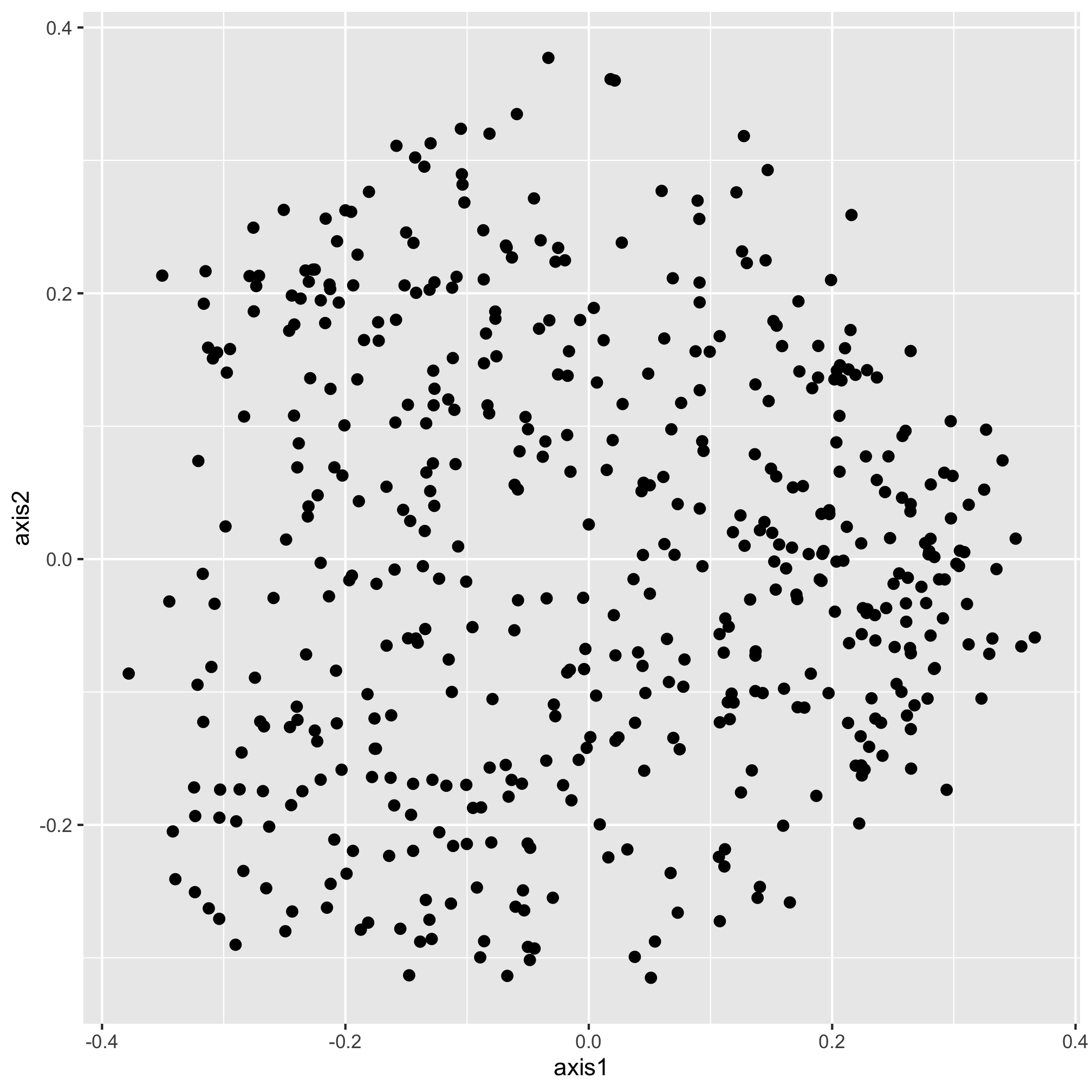
Our new color aesthetic, black, is overwriting the colors for the three diagnosis groups. There are numerous aesthetic values that we can apply to all of the points or that we can map to a specific variable. For example, in addition to color, we could also map the shape of the plotting symbol to the dx column.
ggplot(data=metadata_pcoa, mapping=aes(x=axis1, y=axis2, color=dx, shape=dx)) +
	geom_point(size=2)
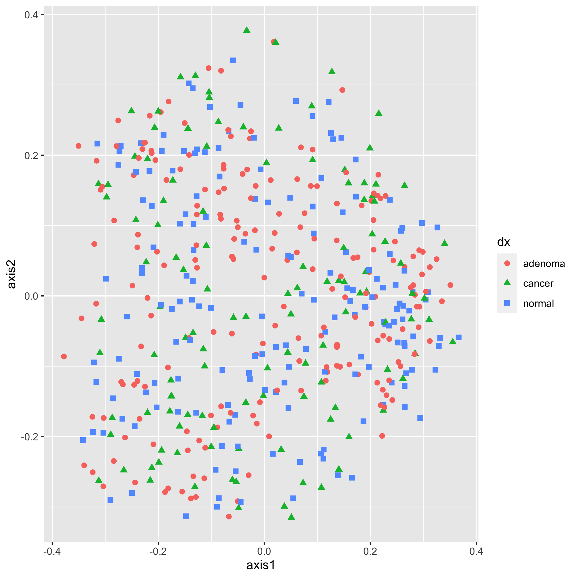
Each geometry (e.g. geom_point) has a set of aesthetics that it will map onto variables. geom_point will use mappings for x, y, size, shape, alpha (i.e. the opacity of the point), and fill and stroke (i.e. the color to use when using plotting symbols 21 through 25). We’ll talk about color and shapes later. For now, let’s go back to the diamond shape, which we had before.
ggplot(data=metadata_pcoa, mapping=aes(x=axis1, y=axis2, color=dx)) +
	geom_point(shape=19, size=2)
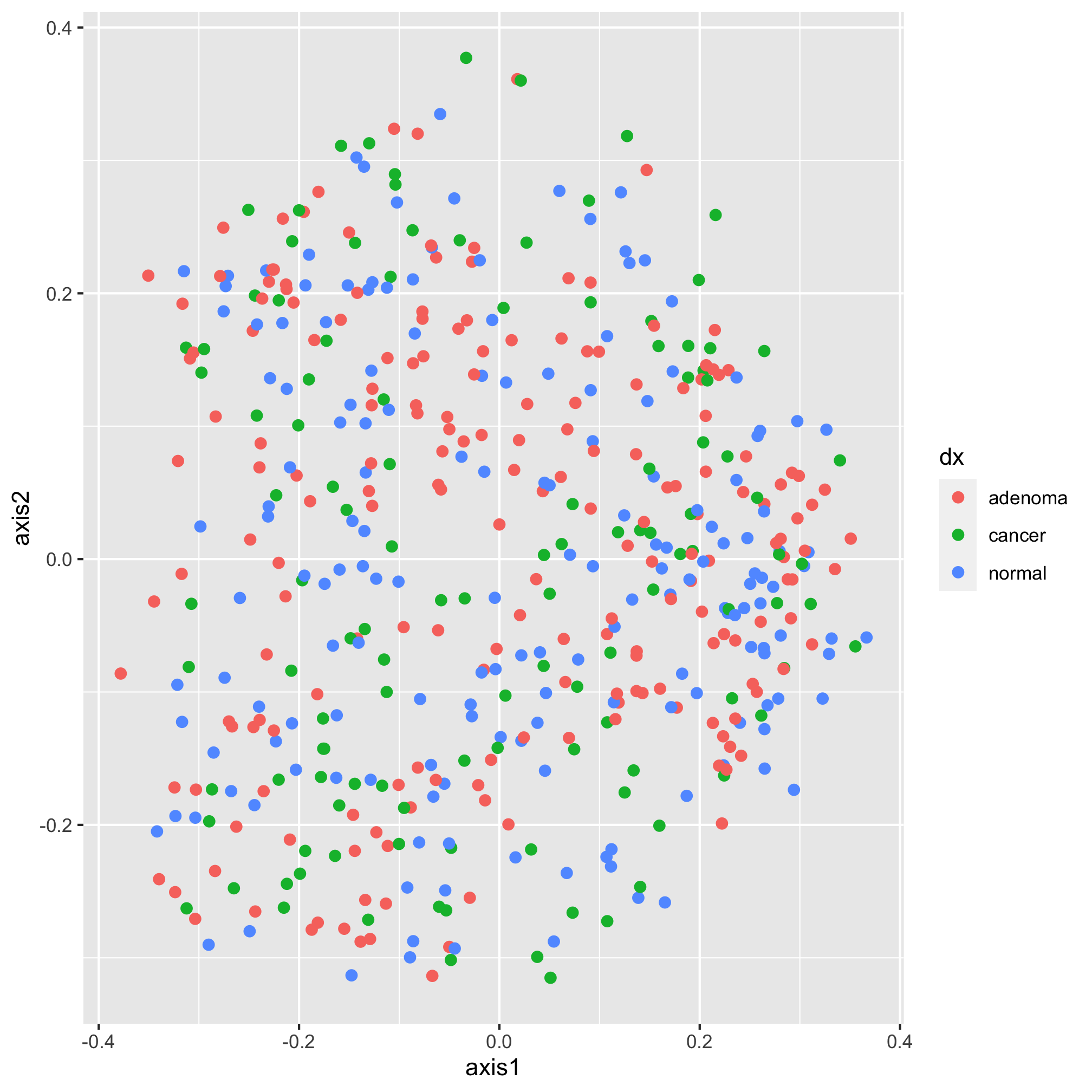
Moving along, we would now like specify the color of our plotting symbols to something other than the default values. This is done using one of ggplot’s scale functions. Here we’ll use scale_color_manual. This function allows us to manually set the colors to the values of dx that we want. It’s been using “adenoma”, “cancer”, and “normal”. Not only are these lower case rather than title case, they are also in an order that reflects the disease progression. We’d like them to go “Noraml”, “Adenoma”, and “Cancer”. I’m also not a fan of having a title on the legend, so we’ll set the name of the scale to NULL rather than dx
ggplot(data=metadata_pcoa, mapping=aes(x=axis1, y=axis2, color=dx)) +
	geom_point(shape=19, size=2) +
	scale_color_manual(name=NULL,
		values=c("blue", "red", "black"),
		breaks=c("normal", "adenoma", "cancer"),
		labels=c("Normal", "Adenoma", "Cancer"))
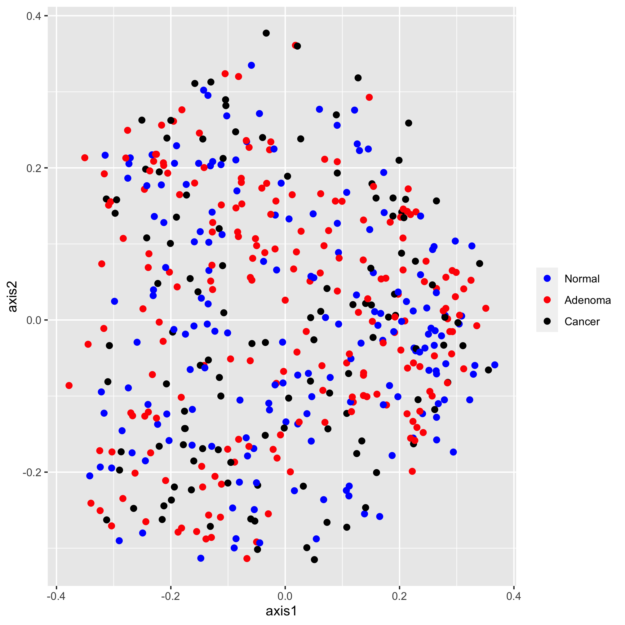
Next, I’d like to set the scale of the axes. We do this with one of the coord functions. By default, the coordinate system is coord_cartesian. For this ordination diagram I would like the shape of the plot to be square, rather than rectangular. We can achieve this with the coord_fixed function
ggplot(data=metadata_pcoa, mapping=aes(x=axis1, y=axis2, color=dx)) +
	geom_point(shape=19, size=2) +
	scale_color_manual(name=NULL,
		values=c("blue", "red", "black"),
		breaks=c("normal", "adenoma", "cancer"),
		labels=c("Normal", "Adenoma", "Cancer")) +
	coord_fixed()
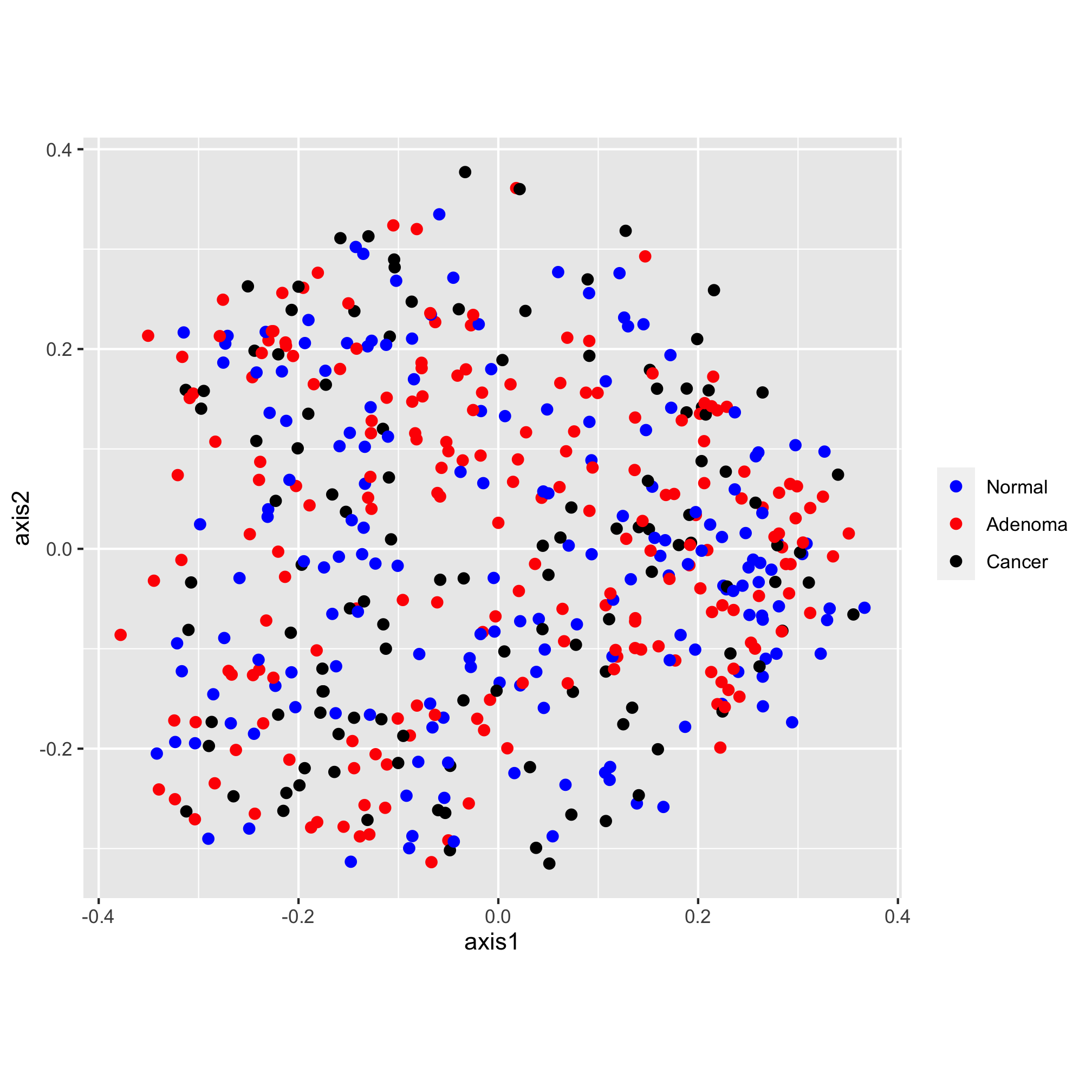
The scatter plot has “axis1” and “axis2” as the x and y-axis labels and lacks an overall title. Let’s give them something a bit more descriptive and professionally formatted. We can do this with the labs function:
ggplot(data=metadata_pcoa, mapping=aes(x=axis1, y=axis2, color=dx)) +
	geom_point(shape=19, size=2) +
	scale_color_manual(name=NULL,
		values=c("blue", "red", "black"),
		breaks=c("normal", "adenoma", "cancer"),
		labels=c("Normal", "Adenoma", "Cancer")) +
	coord_fixed() +
	labs(title="PCoA of Bray-Curtis Distances Between Stool Samples",
		x="PCo Axis 1",
		y="PCo Axis 2")
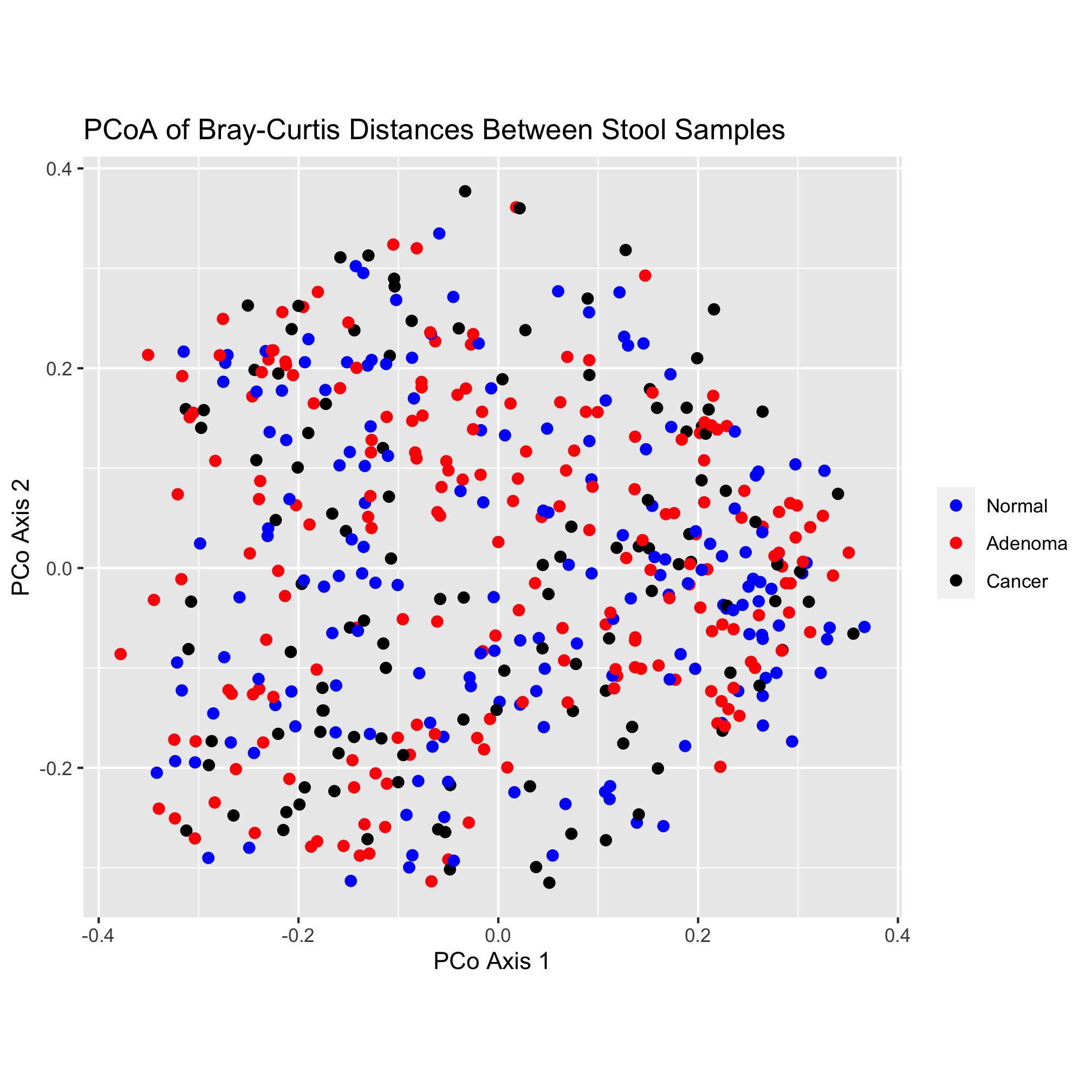
That looks pretty good! One thing that I’m not a fan of is the gray background color or the gridlines. There are many, many options for establishing the theme of the figure. We’ll explore these themes later, but be comforted (or scared) by the fact that you can change virtually everything about the theming of your plots
ggplot(data=metadata_pcoa, mapping=aes(x=axis1, y=axis2, color=dx)) +
	geom_point(shape=19, size=2) +
	scale_color_manual(name=NULL,
		values=c("blue", "red", "black"),
		breaks=c("normal", "adenoma", "cancer"),
		labels=c("Normal", "Adenoma", "Cancer")) +
	coord_fixed() +
	labs(title="PCoA of Bray-Curtis Distances Between Stool Samples",
		x="PCo Axis 1",
		y="PCo Axis 2") +
	theme_classic()

Finally, we’d like to save our figure with the ggsave function. This function is smart enough to know to format the figure as a PDF since the “pdf” extension is in the name. You could also generate a PNG, TIFF, or JPG-formatted imaage.
ggsave("ordination.pdf")
This has been a quick run through the various ggplot-related functions that we can use to build our plot. We’ll spend more time talking about colors and shapes in a moment. In later chapters we’ll also discuss the various geometries, coordinates, and theming elements that we might use to represent our data.
Activity 5
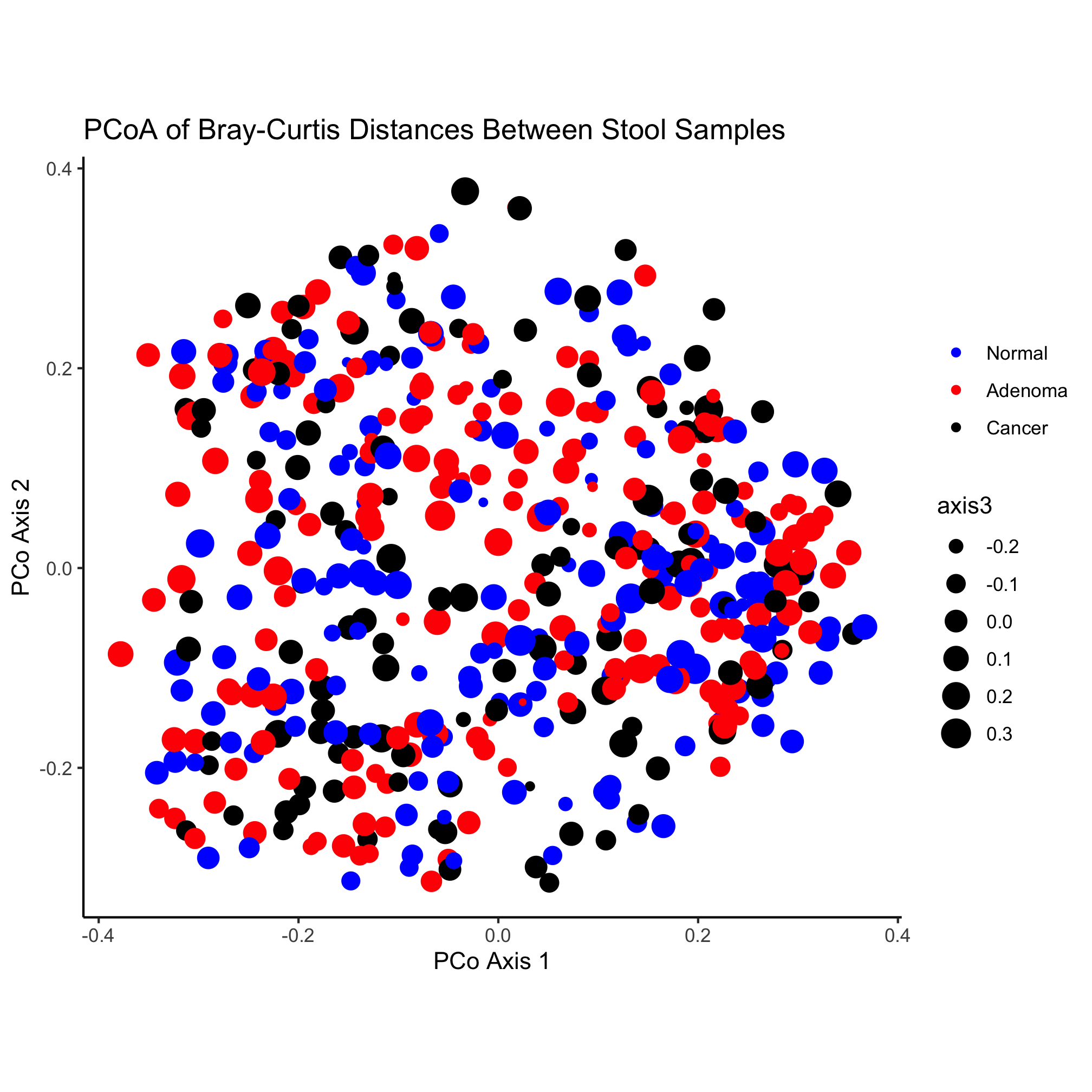
Altering the size of the plotting symbol is commonly called a “bubble chart”. Create a plot where the value of axis3 (the z-axis) is mapped on to the size of the plotting symbol. Don’t worry about manipulating the legend.
Activity 6
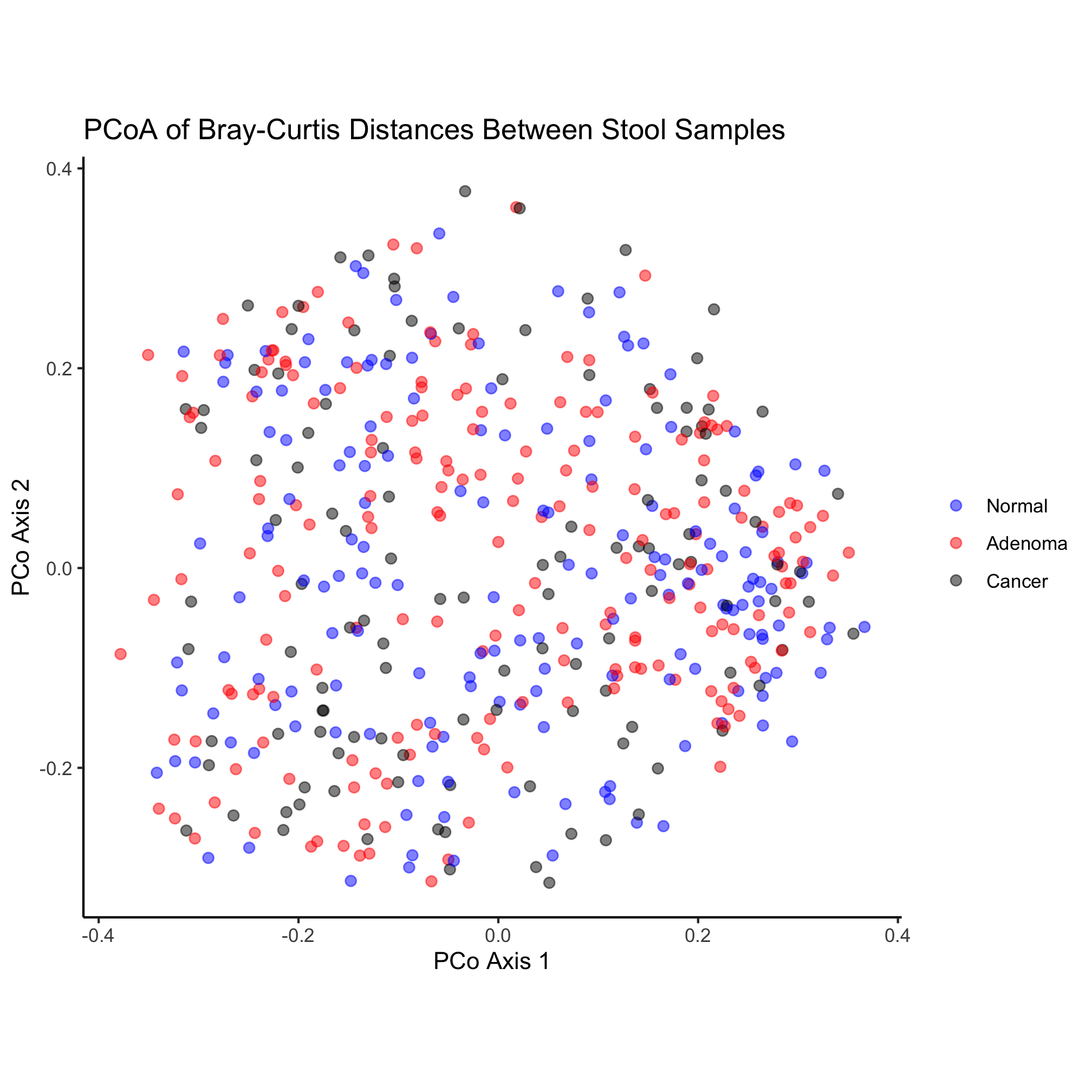
One problem with the original ordination is that there is a tendency for the points to fall on top of each other making for a big mass of point. One of the aesthetic properties of geom_point is alpha, which allows you to set the transparency of each point. Alter the original ggplot code we used to change the alpha of our points to get a better sense of how many points overlap at the same location.
Activity 7
- Think about the data in your research. What variables would you depict by changing the plotting symbol? The symbol color? The symbol’s size?
- What is an appropriate number of colors or plotting symbols to use? Are there colors to stay away from?
- Freehand draw a scatter chart plot of your data. What question are you trying to answer with your plot? What variable goes on the x-axis? y-axis? How do you use color? symbols? size?
- What more do you need to learn to make the plot for your own data?
Activity 8
- What do you think of our original ordination? What works? What doesn’t?
- What question(s) is it seeking to answer?
Plotting symbols
There are 25 different plotting symbols in R that can be set by giving the shape argument a value from 1 to 25. I tend to limit myself to a handful of these: open and closed squares, circles, or triangles. To keep myself from hunting for the right shape value, I made a cheat sheet:
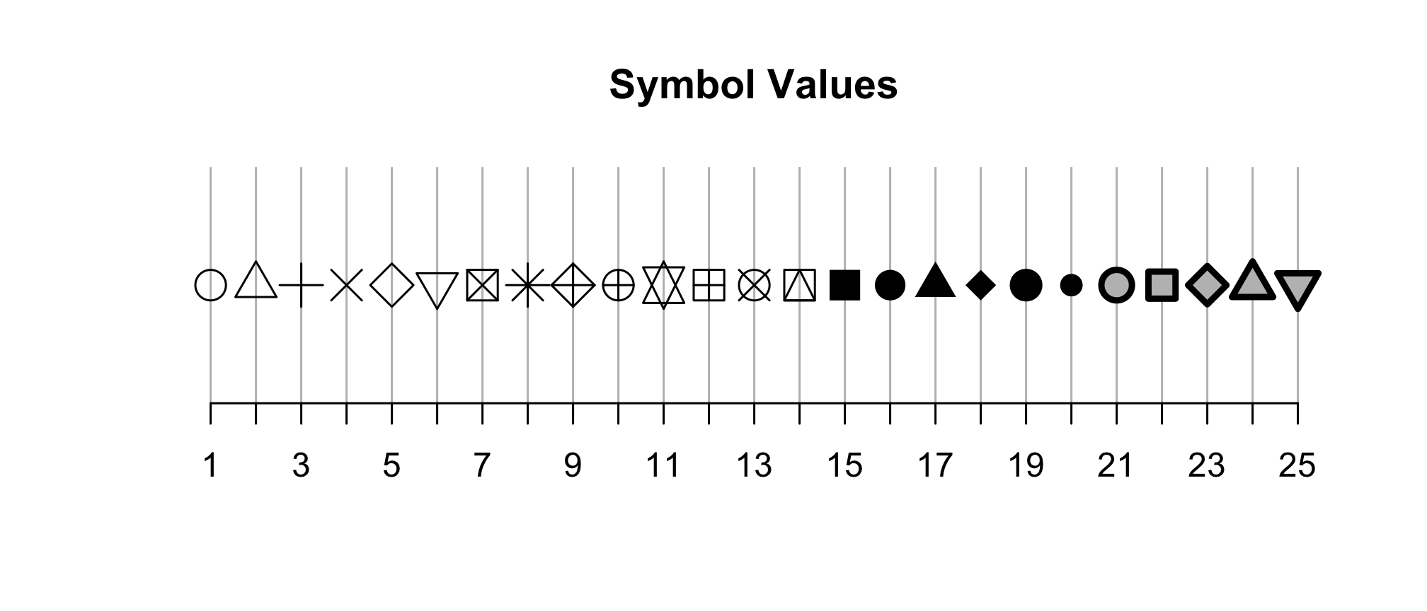
Among these 25 symbols, symbols 21 to 25 are unique. The color of these symbol is taken from the value of fill and the color of the border comes from the value of color. The width of the border can be set with the stroke aesthetic. Let’s give this a shot with our ordination.
ggplot(metadata_pcoa, aes(x=axis1, y=axis2, fill=dx)) +
	geom_point(shape=21, size=2, stroke=0.5) +
	scale_color_manual(name=NULL,
		values=c("blue", "red", "black"),
		breaks=c("normal", "adenoma", "cancer"),
		labels=c("Normal", "Adenoma", "Cancer")) +
	coord_fixed() +
	labs(title="PCoA of Bray-Curtis Distances Between Stool Samples",
		x="PCo Axis 1",
		y="PCo Axis 2") +
	theme_classic()
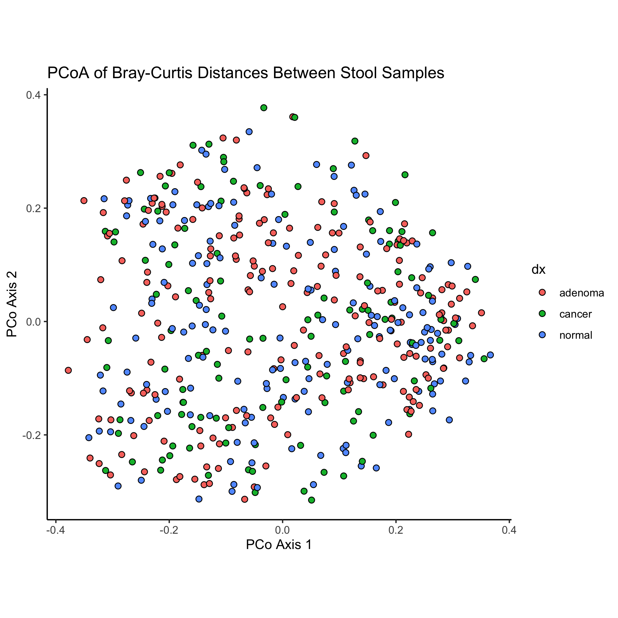
We have a small bug in our code now - our colors don’t seem to be taking. What do you think we need to change to fix the problem?
ggplot(metadata_pcoa, aes(x=axis1, y=axis2, fill=dx)) +
	geom_point(shape=21, size=2, stroke=0.5) +
	scale_fill_manual(name=NULL,
		values=c("blue", "red", "black"),
		breaks=c("normal", "adenoma", "cancer"),
		labels=c("Normal", "Adenoma", "Cancer")) +
	coord_fixed() +
	labs(title="PCoA of Bray-Curtis Distances Between Stool Samples",
		x="PCo Axis 1",
		y="PCo Axis 2") +
	theme_classic()
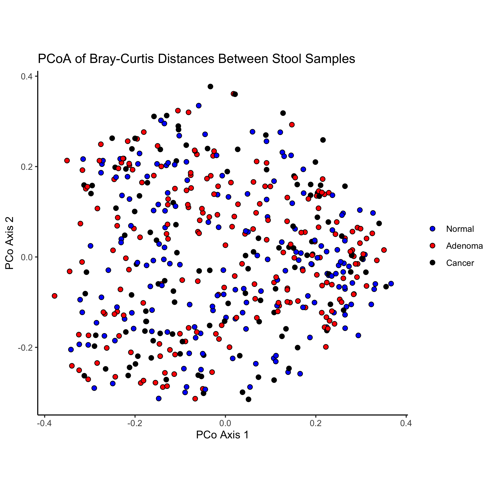
Let’s change our ordination a bit to color our point by the dx column of our data frame and change the shape of the point based on the Gender column. Can you do this without looking ahead?
ggplot(metadata_pcoa, aes(x=axis1, y=axis2, color=dx, shape=Gender)) +
	geom_point(size=2) +
	scale_color_manual(name=NULL,
		values=c("blue", "red", "black"),
		breaks=c("normal", "adenoma", "cancer"),
		labels=c("Normal", "Adenoma", "Cancer")) +
	coord_fixed() +
	labs(title="PCoA of Bray-Curtis Distances Between Stool Samples",
		x="PCo Axis 1",
		y="PCo Axis 2") +
	theme_classic()
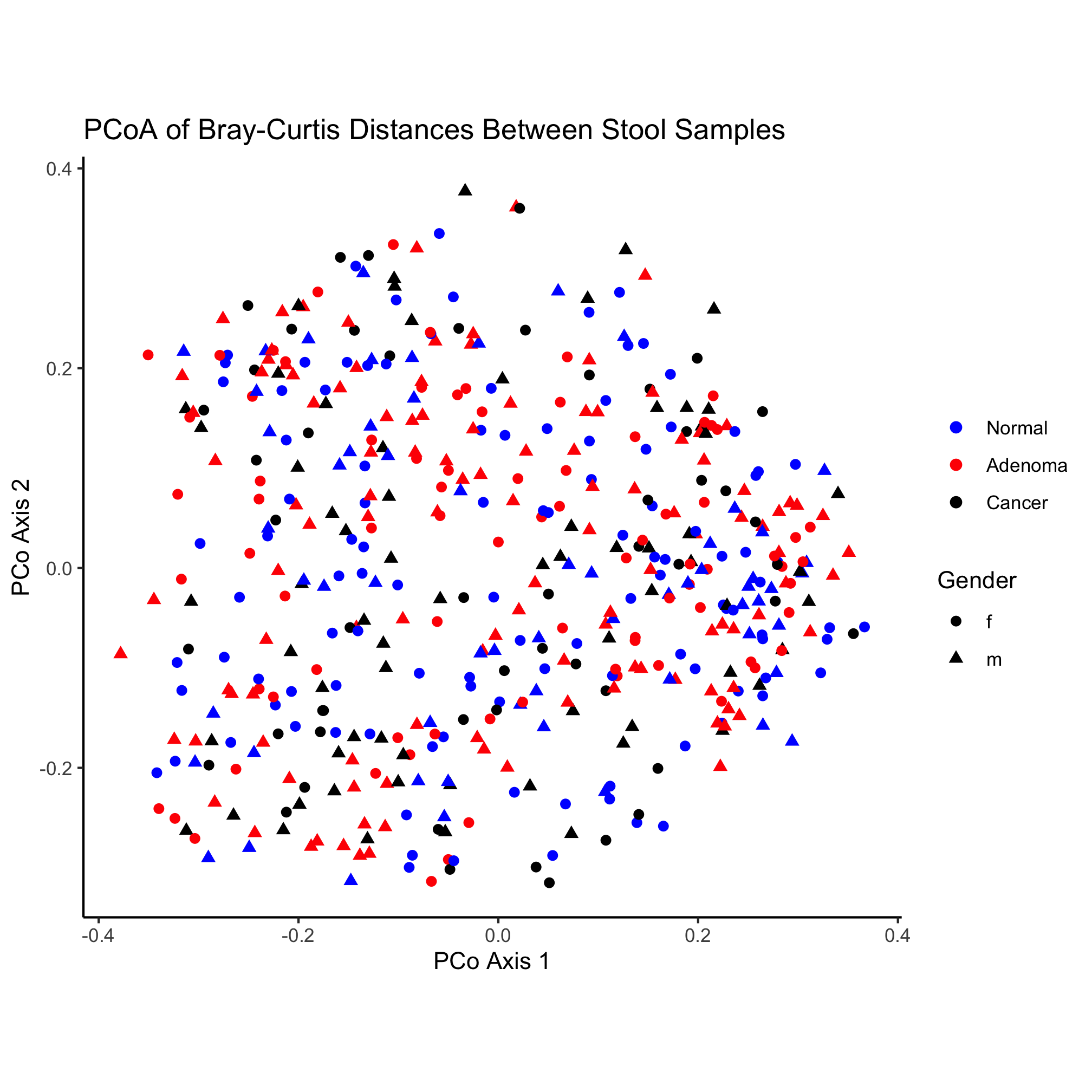
Here again, we have the poorly formatted legend for the shape. Similar to our use of scale_color_manual we can solve the formatting problem using scale_shape_manual
ggplot(metadata_pcoa, aes(x=axis1, y=axis2, color=dx, shape=Gender)) +
	geom_point(size=2) +
	scale_color_manual(name=NULL,
		values=c("blue", "red", "black"),
		breaks=c("normal", "adenoma", "cancer"),
		labels=c("Normal", "Adenoma", "Cancer")) +
	scale_shape_manual(name=NULL,
		values=c(19, 17),
		breaks=c("f", "m"),
		labels=c("Female", "Male")) +
	coord_fixed() +
	labs(title="PCoA of Bray-Curtis Distances Between Stool Samples",
		x="PCo Axis 1",
		y="PCo Axis 2") +
	theme_classic()
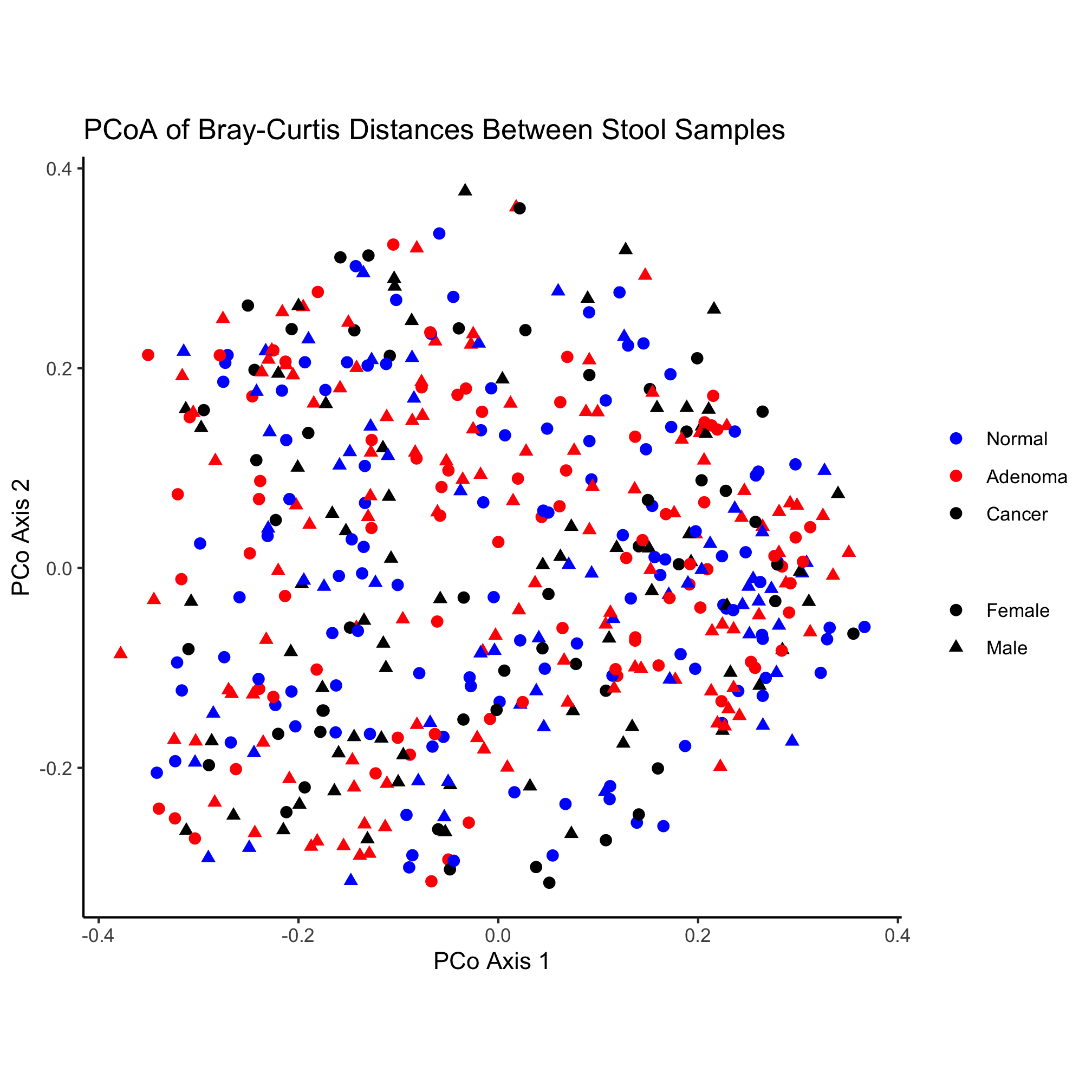
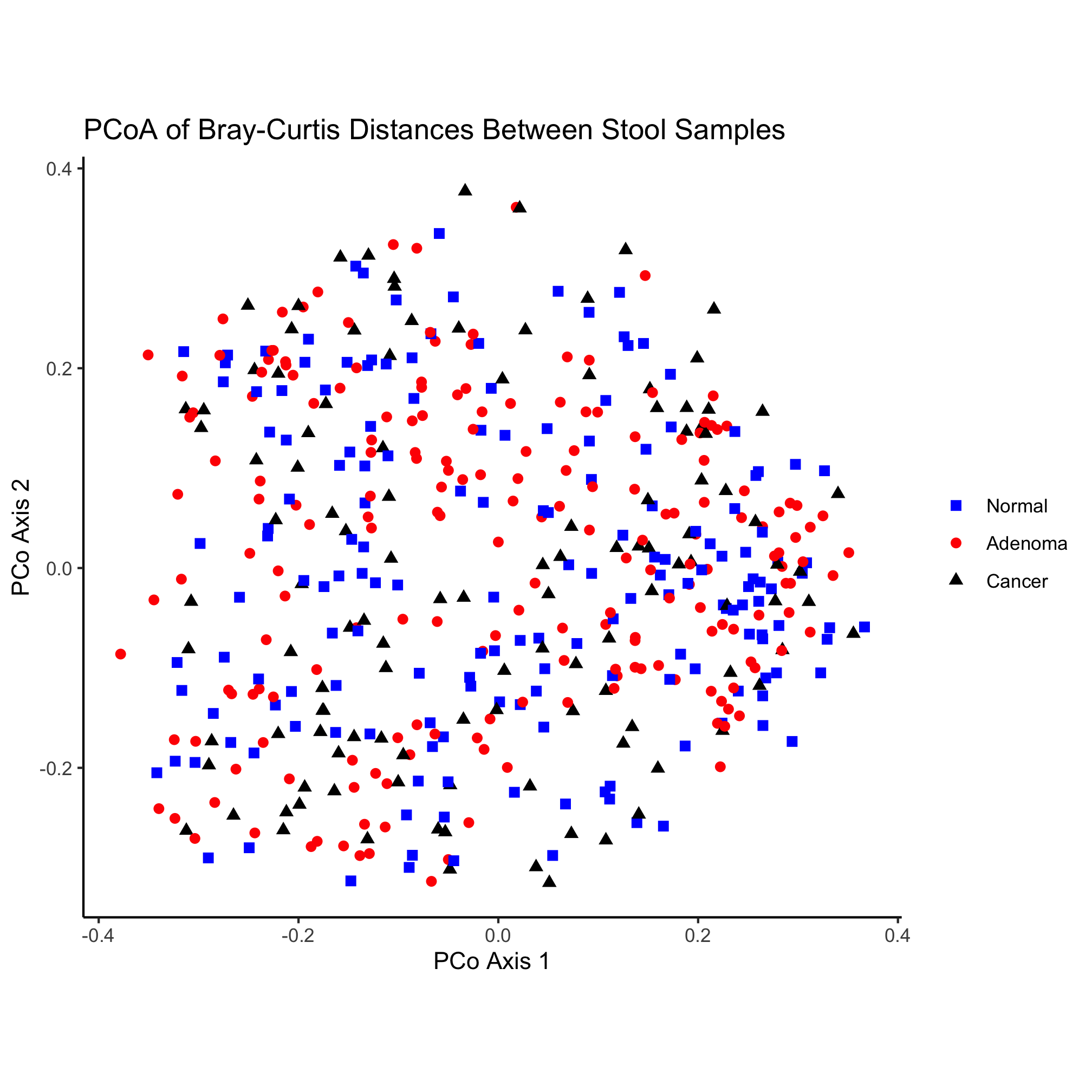
Nothing really pops out in the ordination to suggest that there’s a difference between diagnosis group or sex. Instead of mapping the subject’s sex onto the shape, let’s map the diagnosis onto the shape and color.
ggplot(metadata_pcoa, aes(x=axis1, y=axis2, color=dx, shape=dx)) +
	geom_point(size=2) +
	scale_color_manual(name=NULL,
		values=c("blue", "red", "black"),
		breaks=c("normal", "adenoma", "cancer"),
		labels=c("Normal", "Adenoma", "Cancer")) +
	scale_shape_manual(name=NULL,
		values=c(15, 16, 17),
		breaks=c("normal", "adenoma", "cancer"),
		labels=c("Normal", "Adenoma", "Cancer")) +
	coord_fixed() +
	labs(title="PCoA of Bray-Curtis Distances Between Stool Samples",
		x="PCo Axis 1",
		y="PCo Axis 2") +
	theme_classic()
Color
So far we’ve used some basic colors to color our points. For the primary colors, these names work pretty well. You can get a listing of the various named colors in R with the colors() function
colors()
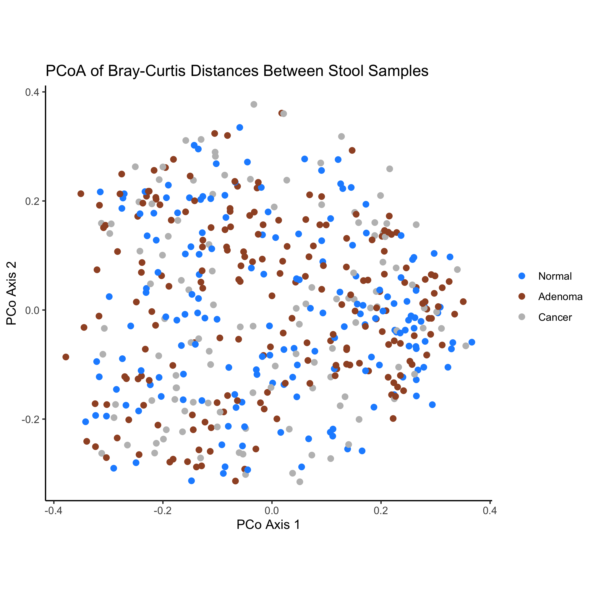
Revisiting our original ordination we might try to soften the saturation of the colors a bit
ggplot(metadata_pcoa, aes(x=axis1, y=axis2, color=dx)) +
	geom_point(shape=19, size=2) +
	scale_color_manual(name=NULL,
		values=c("dodgerblue", "sienna", "gray"),
		breaks=c("normal", "adenoma", "cancer"),
		labels=c("Normal", "Adenoma", "Cancer")) +
	coord_fixed() +
	labs(title="PCoA of Bray-Curtis Distances Between Stool Samples",
		x="PCo Axis 1",
		y="PCo Axis 2") +
	theme_classic()
There are numerous color palette options available. Unfortunately, the palettes that are built into R leave a bit to be desired. Several R packages are available for picking colors that work well together. One popular website for identifying good palettes is ColorBrewer and these palettes are available as the RColorBrewer package. You can install a packages with the install.packages function
install.packages("RColorBrewer")
When you run this command, R will likely ask you where you want to download the package from. It probably doesn’t really matter, although I typically pick the one closest to me: 58. As we saw with the tidyverse package, we need to load it with the library function.
library(RColorBrewer)
We can get a sense of the package by running the following
?RColorBrewer
RColorBrewer           package:RColorBrewer            R Documentation

ColorBrewer palettes

Description:

     Creates nice looking color palettes especially for thematic maps

Usage:

     brewer.pal(n, name)
     display.brewer.pal(n, name)
     display.brewer.all(n=NULL, type="all", select=NULL, exact.n=TRUE,
     colorblindFriendly=FALSE)
     brewer.pal.info

Arguments:

       n: Number of different colors in the palette, minimum 3, maximum
          depending on palette

    name: A palette name from the lists below

    type: One of the string "div", "qual", "seq", or "all"

  select: A list of names of existing palettes

 exact.n: If TRUE, only display palettes with a color number given by n

colorblindFriendly: if TRUE, display only colorblind friendly palettes

Details:

     ‘brewer.pal’ makes the color palettes from ColorBrewer available
     as R palettes.

     ‘display.brewer.pal()’ displays the selected palette in a graphics
     window.

     ‘display.brewer.all()’ displays the a few palettes simultanueously
     in a graphics window.

     ‘brewer.pal.info’ returns information about the available palettes
     as a dataframe. ‘brewer.pal.info’ is not a function, it is a
     variable. This might change in the future.

     For details and an interactive palette selection tools see
     http://colorbrewer.org. It is free to use, although ColorBrewer's
     designers would appreciate it if you could cite the ColorBrewer
     project if you decide to use one of our color schemes.

     There are 3 types of palettes, sequential, diverging, and
     qualitative.
     1. Sequential palettes are suited to ordered data that progress
     from low to high.  Lightness steps dominate the look of these
     schemes, with light colors for low data values to dark colors for
     high data values.
     2. Diverging palettes put equal emphasis on mid-range critical
     values and extremes at both ends of the data range. The critical
     class or break in the middle of the legend is emphasized with
     light colors and low and high extremes are emphasized with dark
     colors that have contrasting hues.
     3. Qualitative palettes do not imply magnitude differences between
     legend classes, and hues are used to create the primary visual
     differences between classes.  Qualitative schemes are best suited
     to representing nominal or categorical data.

     The sequential palettes names are
     Blues BuGn BuPu GnBu Greens Greys Oranges OrRd PuBu PuBuGn PuRd
     Purples RdPu Reds YlGn YlGnBu YlOrBr YlOrRd

     All the sequential palettes are available in variations from 3
     different values up to 9 different values.

     The diverging palettes are
     BrBG PiYG PRGn PuOr RdBu RdGy RdYlBu RdYlGn Spectral

     All the diverging palettes are available in variations from 3
     different values up to 11 different values.

     For qualitative palettes, the lowest number of distinct values
     available always is 3, but the largest number is different for
     different palettes. It is given together with the palette names in
     the following table.

       Accent    8
       Dark2     8
       Paired   12
       Pastel1   9
       Pastel2   8
       Set1      9
       Set2      8
       Set3     12

     ColorBrewer is Copyright (c) 2002 Cynthia Brewer, Mark Harrower,
     and The Pennsylvania State University.  All rights reserved.
     The ColorBrewer palettes have been included in this R package with
     permission of the copyright holder.
     For license details see the file ‘COPYING’ included in this
     package.

Value:

     A palette
     You will get an error when you ask for a nonexisting palette, and
     you will get a warning if a palette you asked for exists but not
     with as many different leves as you asked for.

Note:

     More information on ColorBrewer is available at its Website, <URL:
     http://www.colorbrewer.org>.

Author(s):

     Erich Neuwirth, University of Vienna, <email:
     erich.neuwirth@univie.ac.at>, with contributions by John
     Maindonald, Australian National University, <email:
     john.maindonald@anu.edu.au>

Examples:

     ## create a sequential palette for usage and show colors
     mypalette<-brewer.pal(7,"Greens")
     image(1:7,1,as.matrix(1:7),col=mypalette,xlab="Greens (sequential)",
            ylab="",xaxt="n",yaxt="n",bty="n")
     ## display a divergent palette
     display.brewer.pal(7,"BrBG")
     devAskNewPage(ask=TRUE)
     ## display a qualitative palette
     display.brewer.pal(7,"Accent")
     devAskNewPage(ask=TRUE)
     ## display a palettes simultanoeusly
     display.brewer.all(n=10, exact.n=FALSE)
     devAskNewPage(ask=TRUE)
     display.brewer.all(n=10)
     devAskNewPage(ask=TRUE)
     display.brewer.all()
     devAskNewPage(ask=TRUE)
     display.brewer.all(type="div")
     devAskNewPage(ask=TRUE)
     display.brewer.all(type="seq")
     devAskNewPage(ask=TRUE)
     display.brewer.all(type="qual")
     devAskNewPage(ask=TRUE)
     display.brewer.all(n=5,type="div",exact.n=TRUE)
     devAskNewPage(ask=TRUE)
     display.brewer.all(colorblindFriendly=TRUE)
     devAskNewPage(ask=TRUE)
     brewer.pal.info
     brewer.pal.info["Blues",]
     brewer.pal.info["Blues",]$maxcolors
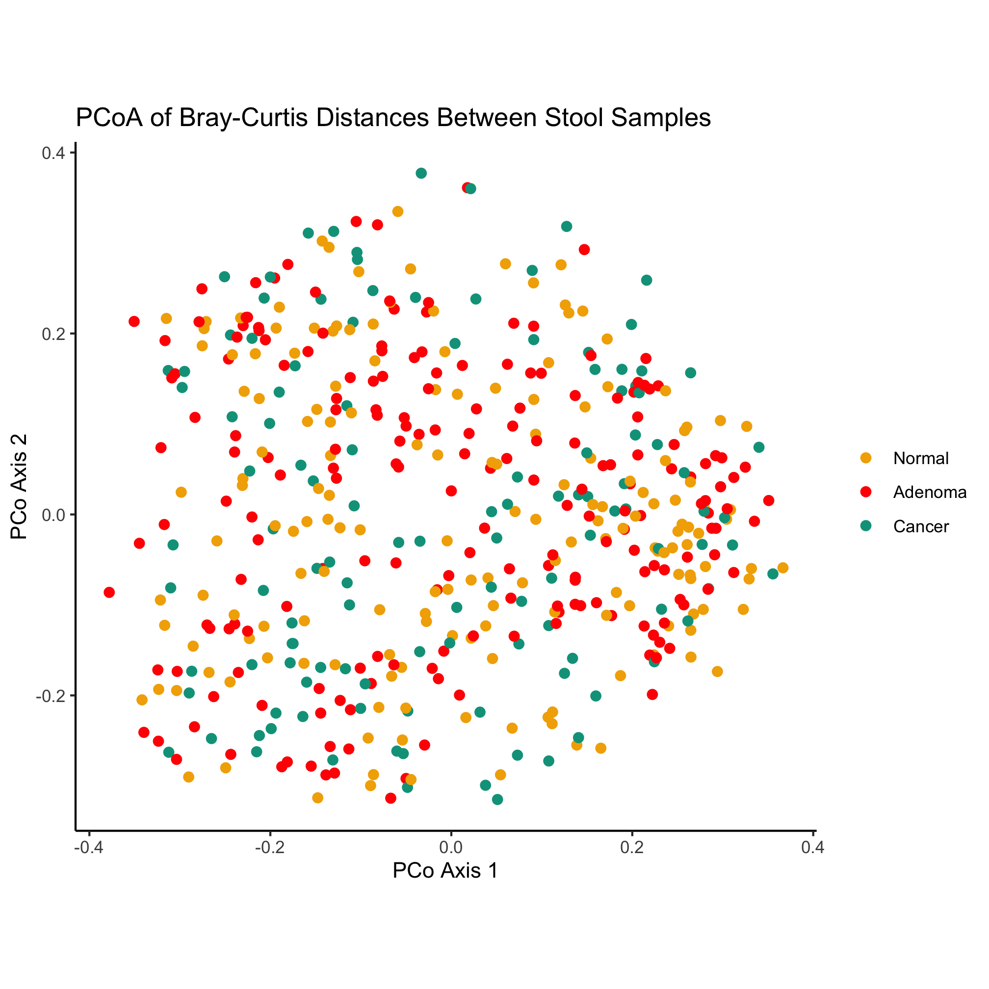
The ? function is useful for getting help pages on our favorite functions. Used like we did here, it pulls up a help page for the package. We see that there are a number of nicely named functions that tell us what they do. For our ordination we would like 3 colors for use with qualitative data that are friendly to our color blind friends. Reading through the documentation and the Examples section at the end, let’s run this command.
display.brewer.all(n=3, type="qual", colorblindFriendly=TRUE)
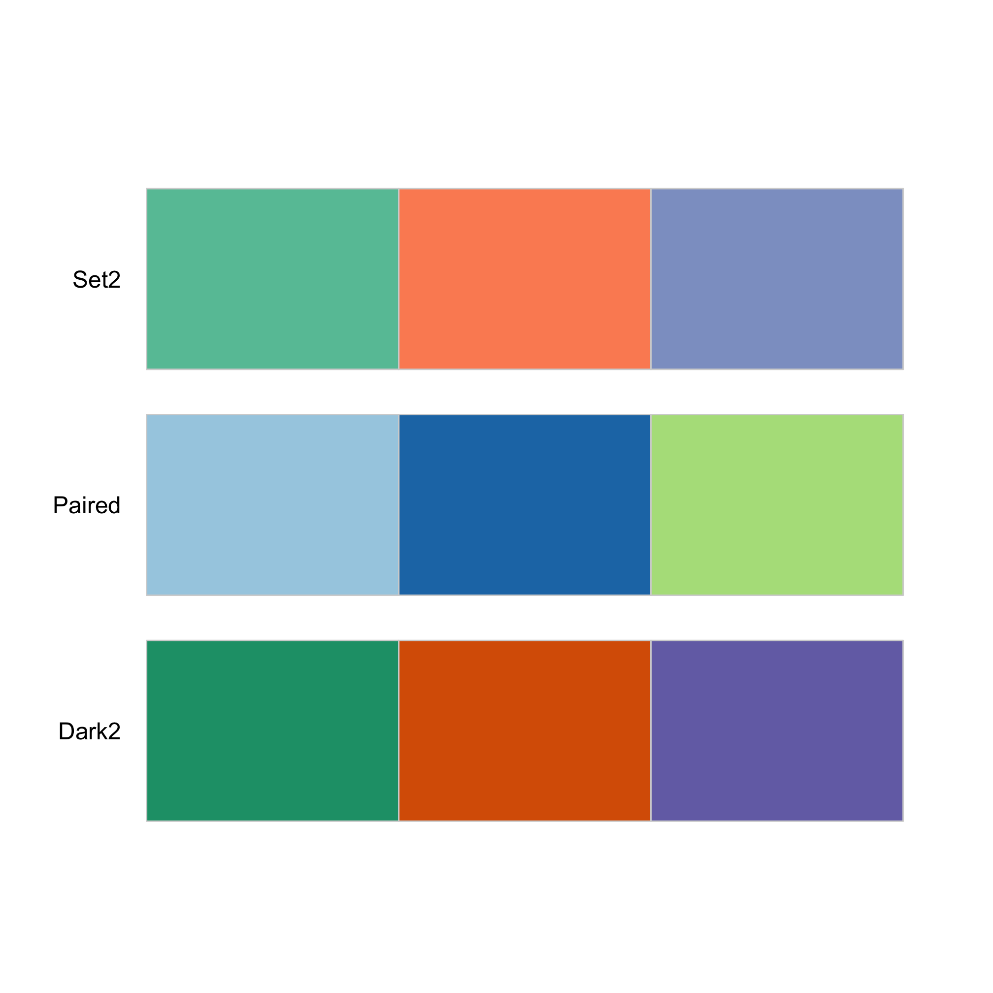
This pops up a set of three options that we can now use for our ordination with the brewer.pal function. The “Set2” palette are the default ggplot colors. Instead, let’s use the Dark2 palette.
ggplot(metadata_pcoa, aes(x=axis1, y=axis2, color=dx)) +
	geom_point(shape=19, size=2) +
	scale_color_manual(name=NULL,
		values=brewer.pal(n=3, name="Dark2"),
		breaks=c("normal", "adenoma", "cancer"),
		labels=c("Normal", "Adenoma", "Cancer")) +
	coord_fixed() +
	labs(title="PCoA of Bray-Curtis Distances Between Stool Samples",
		x="PCo Axis 1",
		y="PCo Axis 2") +
	theme_classic()
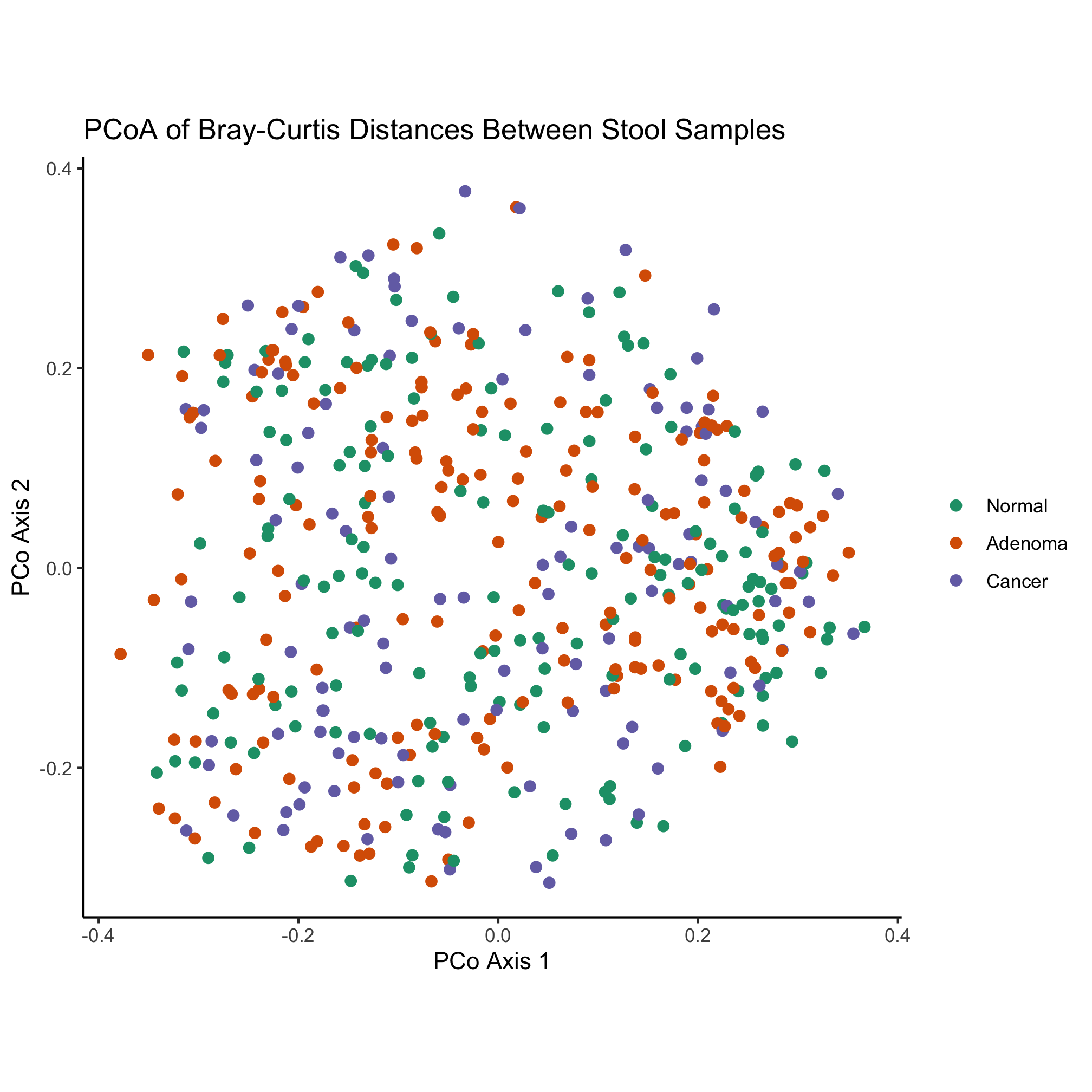
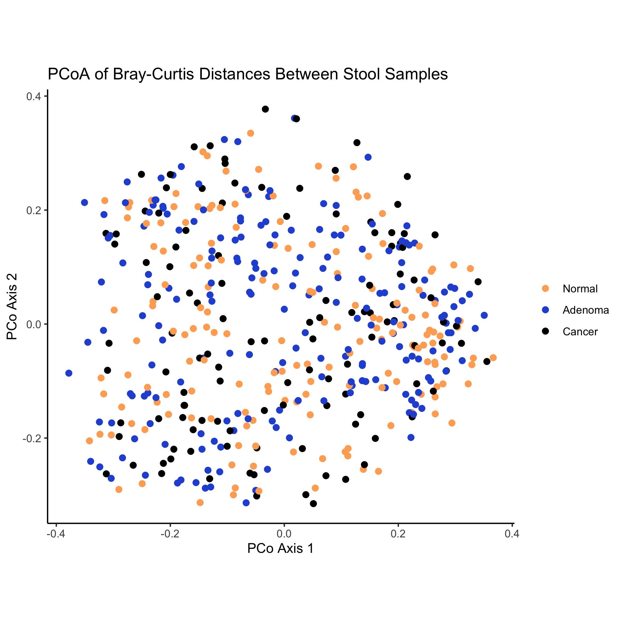
Some more whimsical options include the beyonce and wesanderson color palettes. Another option is to find a website who’s color scheme you really like and use a color picker browser extension or Adobe Photoshop to get the HTML code for colors you like. For example, the two dominant colors on this site are #FFAC63 and #2857D6. These HTML color codes are hexidecimal numbers and can be used like you would a named color. Instead of using named colors, we could use these two colors along with black to color our ordination
ggplot(metadata_pcoa, aes(x=axis1, y=axis2, color=dx)) +
	geom_point(shape=19, size=2) +
	scale_color_manual(name=NULL,
		values=c('#FFAC63', '#2857D6', 'black'),
		breaks=c("normal", "adenoma", "cancer"),
		labels=c("Normal", "Adenoma", "Cancer")) +
	coord_fixed() +
	labs(title="PCoA of Bray-Curtis Distances Between Stool Samples",
		x="PCo Axis 1",
		y="PCo Axis 2") +
	theme_classic()
Activity 9
What if you run brewer.pal(n=3, name="Dark2") at the prompt in R?
Activity 10
Install the wesanderson R package and pick a theme to color the ordination
